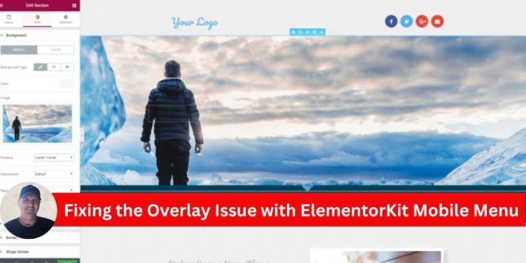
If you’re using ElementorKit for your website and encounter an issue where the mobile menu overlay prevents users from closing the menu, you’re not alone. This is a known bug where the menu remains visible, even though users can scroll the page. The “X” close button becomes unresponsive, leading to a frustrating user experience. Fortunately, there’s a straightforward solution to this problem.
Understanding the Issue
The problem stems from conflicting z-index values in the mobile menu’s overlay and the menu container. The overlay covers the close button, making it impossible for users to interact with it. As a result, the menu stays open even if users try to close it or click outside the menu area.
Step-by-Step Solution
Here’s how you can resolve the issue by adjusting the z-index values in Elementor:
1. Open the Header in Elementor
- Navigate to your WordPress dashboard.
- Go to Templates > Saved Templates and locate your header.
- Click Edit with Elementor to open the header template in the Elementor editor.
2. Adjust the Overlay’s z-index
- Select the container that holds your mobile menu overlay.
- Under the Advanced tab, scroll down to the Custom CSS section.
- Add the following CSS code:
z-index: auto !important;
This ensures the overlay’s z-index does not override the close button or interfere with user interactions.
3. Set a High z-index for the Menu
- Now, select the mobile menu container (the element containing the menu items and close button).
- Under the Advanced tab, locate the z-index field.
- Set the z-index to 5000 specifically for the mobile view. You can do this by switching to the responsive mode in Elementor and selecting the mobile view.
- Desktop View: Leave the z-index as is.
- Mobile View: Set z-index to 5000.
4. Save and Test
- Save your changes by clicking Update.
- Test your mobile menu to ensure the overlay no longer blocks the close button, and the menu closes as expected when clicking outside or using the “X” button.
Why This Works
The overlay’s default z-index is often too high, causing it to sit above interactive elements like the close button. By setting the overlay’s z-index to auto and increasing the menu’s z-index to 5000, you prioritize the menu and its interactive elements over the overlay.
Final Thoughts
This z-index conflict in ElementorKit is a common bug, but with the above solution, you can quickly fix the issue and restore the expected behavior of your mobile menu. Keeping your mobile menu functional is essential for user experience, especially since mobile users make up a significant portion of web traffic.
If the issue persists despite these changes, consider reaching out to ElementorKit’s support team for further assistance.

![ChatGPT Hecho Simple [ChatGPT Made Simple]: Cómo Cualquiera Puede Usar La Inteligencia Artificial Para Mantenerse Competitivo & Potenciar Su Productividad Laboral, Académica … La Ingeniería De Prompts [How Anyone Can Use Artificial Intelligence to Stay Competitive & Boost Their Workplace, Academic Productivity… Prompts Engineering]](https://i3.wp.com/m.media-amazon.com/images/I/71ULDECMUKL._SL1500_.jpg?w=300&resize=300,300&ssl=1 "ChatGPT Hecho Simple [ChatGPT Made Simple]: Cómo Cualquiera Puede Usar La Inteligencia Artificial Para Mantenerse Competitivo & Potenciar Su Productividad Laboral, Académica … La Ingeniería De Prompts [How Anyone Can Use Artificial Intelligence to Stay Competitive & Boost Their Workplace, Academic Productivity… Prompts Engineering]")


")
")


